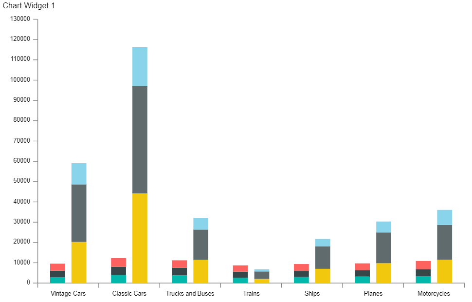
Optional Grouping Colors
Optional Grouping Colors: This video contains how does optional grouping color works in the dashboard in AIV.
This document contains information on a feature Optional Grouping Colors. In AIV, the user can add multiple Series when required. Optional Grouping color will be enabled when we are using Optional Y series Grouping Property.
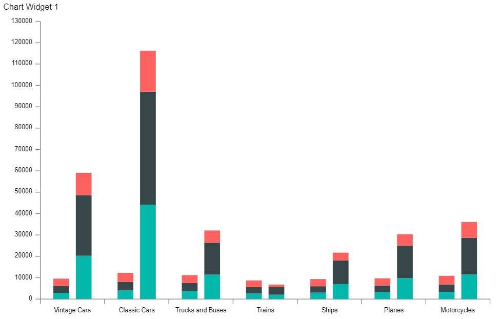
In this Scenario we are using Stacked Chart widget and two series with different value column and Year in optional Y series Grouping so now we can enable the Optional Grouping color in Formatting >> General>> Color & Theme Property. When we select Year in optional Y Series Grouping in both the series. We will be able to enable the optional grouping color option and it will take same color in both the series with the same year.
- Click on the Hamburger icon.
- Create dashboard box will be shown on the screen. Users can create a dashboard by clicking on the + icon.
- Users can set the dashboard name as per their requirements. Click on create button after entering the dashboard name in the dialog box. As shown in the below image.
- Users will see an empty Dashboard, as shown in the image below:
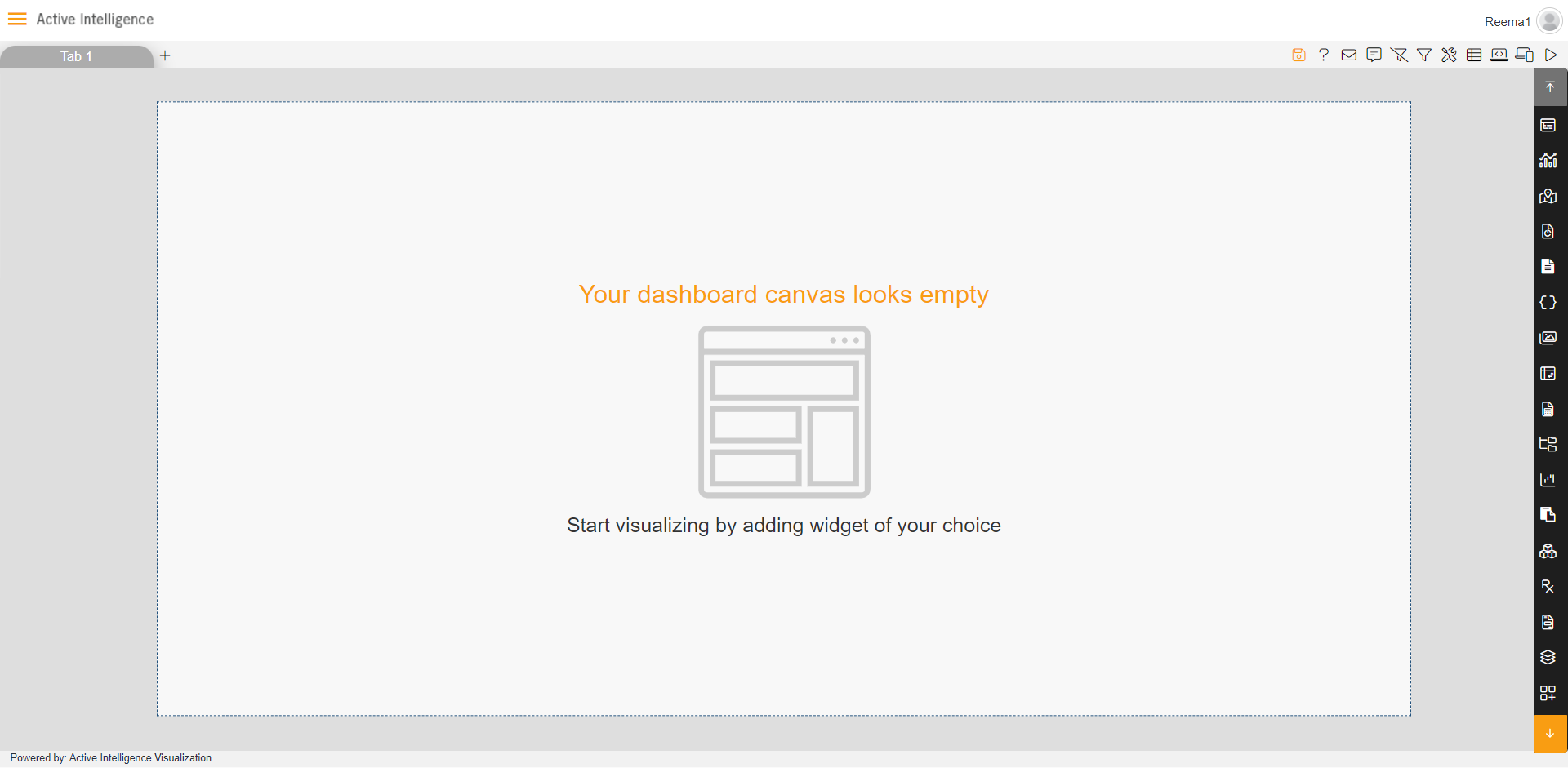
- From the right vertical menu select the chart widget icon.
- The Edit menu box appears as you click on chart icon. And a widget gets added in content place automatically in dashboard. As shown in the below image.
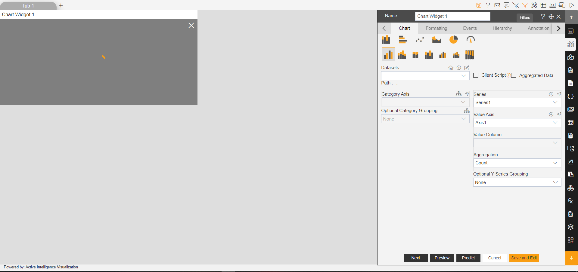
- Enter the following details in the edit menu of the chart:
- Dataset: Sales.ds
- Category Axis: productLine
- Value Column: extendedPrice
- Aggregation: Avg
- Optional Y series Grouping: Year
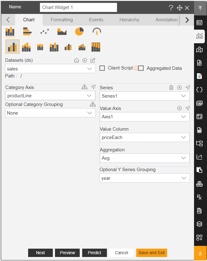
- Click on the (+) icon in the series & add new series.
- In Series 2, enter the following data in the edit menu:
- Select the Stacked Chart
- Category Axis: productLine
- Value Column: priceEach
- Aggregation: Sum
- Select the Stacked Chart.
- Fill above details, as shown in figure below:

- Click on Preview & Save and Exit.
- Edit menu will look as per the image below:
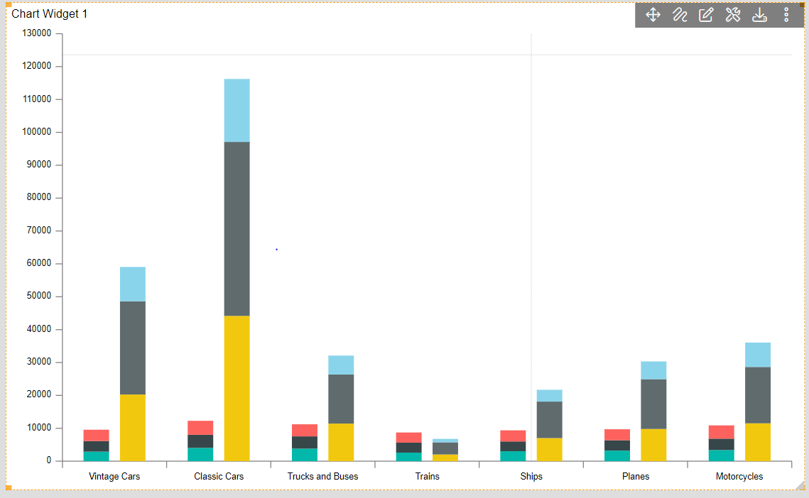
- Here you can see for both the series, year grouping color is different. For 1st series year 2016 value is green whereas for the 2 series its color is yellow. To make is consistent across widgets, we use optional grouping colors setting.
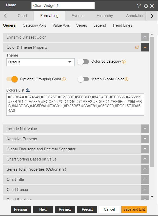
- In Edit Chart Widget Go to Formatting Property >> General Tab >> Color & Theme Property.
- Toggle the Optional Grouping Color button, as shown in figure below:
- Click on Preview & Save and Exit.
- Click on the dashboard Preview option from the top right corner of the dashboard.

- Your screen will look as per the image below:
- Now go to the Edit dashboard option for the top right corner of the dashboard.
- Go to Edit Menu >> Formatting Property >> General tab.
- Click on the refresh button given at the Color & Theme property tab.

- Click on Save and Exit, Now Preview the dashboard as did earlier.
- And your dashboard will look as per the image below.
